


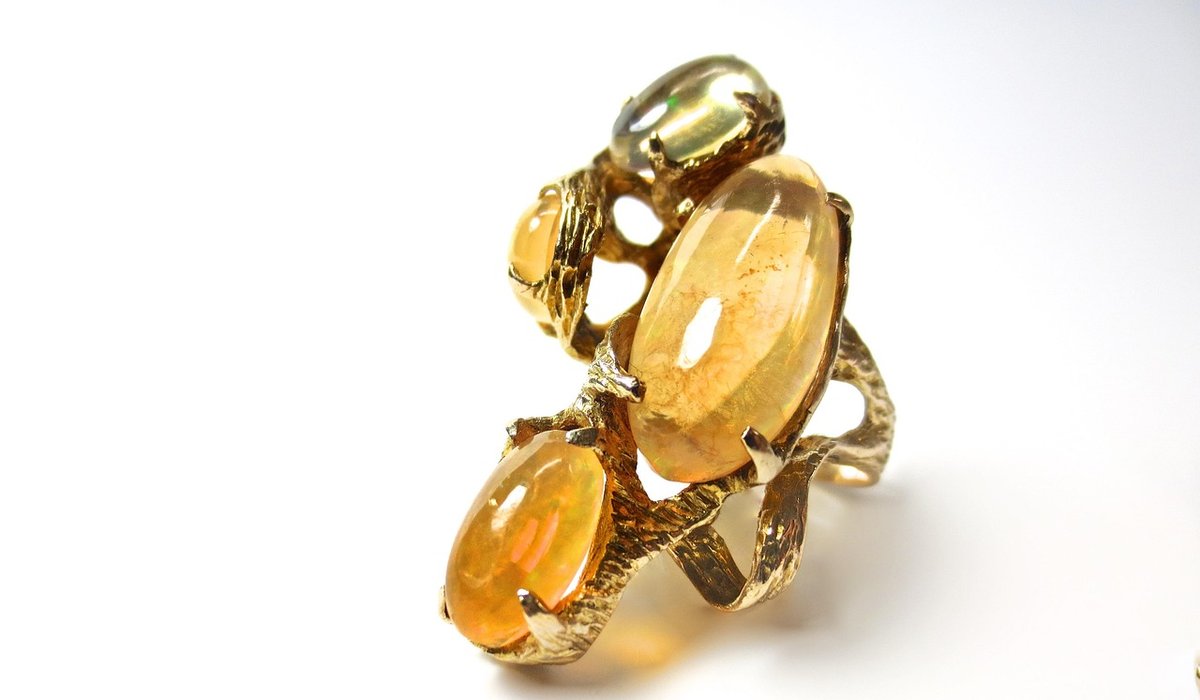
On a grey Tuesday in February, the most comfortable rooms in Britain tend to be doing three things at once: layering matte against shine, keeping their colours low and close, and letting one small thing catch the light. Opal-inspired decorating follows that instinct. Instead of a bright palette, you work with milky whites, soft grey-blue and pale blush, then add a flash — a thread, a nap, a fleck of colour that shifts as you move. Velvet and linen are the ideal carriers for it.
Start With the Opal Palette
Opal colour is less a shade than a family: milky white, dove grey, palest aqua, smoky blue, shell pink and soft lilac, with flashes of sea-green and peach hidden inside. Build the room from these quiet, slightly dirty neutrals and save saturated gemstone tones for small objects — a lamp base, a lacquered box, a handful of cushion corners.
Let your room's light choose the base. North-facing rooms receive cool, even light all day, so warm the palette with off-white, oatmeal and blush linen. South-facing rooms can carry grey-blue, lilac and pale jade without turning chilly. A useful proportion is roughly 60 per cent quiet opal neutrals, 30 per cent one deeper gemstone tone, 10 per cent shimmer.
Why Velvet and Linen Belong Together
Linen scatters light. Its slubby, matte surface breaks up daylight and offers texture without reflection, which is exactly why it makes such a calm base for large curtain panels and cushion backs. Velvet absorbs light instead, and because the pile has a direction, a single piece of cloth can read as two colours: brush with the nap and it looks lighter, stroke against it and it darkens. That is a free, gentle iridescence that needs no metallic thread at all.
Combine them so linen carries the area and velvet carries the accent. A linen-velvet blend is worth knowing about for cottages and modern flats where full velvet feels too grand — you keep the depth without the formality.
Where Iridescent Threads Earn Their Keep
Iridescent threads — fine filaments that shift colour as light moves across them — work best as punctuation rather than paragraphs. In practice that means:
- A piped edge on a plain linen cushion, in a tone a shade deeper than the fabric.
- A narrow taped band down the leading edge of a curtain.
- A single woven stripe running through otherwise plain linen, visible only when the light rakes across it.
- One small embroidered motif at a cushion corner, kept deliberately off-centre.
Check any shimmering fabric under both daylight and your actual lamps before committing; coarse metallic weaves can look brassy under warm bulbs. If a thread feels stiff or scratchy, it will not soften with washing, so keep it away from chair backs and anywhere bare arms rest.
Curtains: Weight, Pleats and a Flash of Nap
Curtains are where the contrast does the most work, because they move. Two approaches suit British rooms. The first is a generous linen panel with a 10–15cm velvet strip down the leading edge: as the curtain is drawn, the edge rolls and flashes between matte and deep. The second is velvet panels with a linen lining turned back at the top, letting the lighter fabric show through the pleats.
Weight matters in a draughty Victorian terrace. Interline with cotton flannel or bump and add a lining, or use a thermal lining alone for a leaner look. Double and pinch pleats hold the fabric in vertical folds and flatter the pile direction; eyelet headings suit relaxed washed linen. Allow at least twice the track width in fabric, and two and a half times for velvet. If you use velvet, brush every panel the same way before hanging, or the folds will read as mismatched rather than deliberate. A braided tieback with a metallic thread carries the theme up to eye level.
Cushions: Where to Experiment
Cushions let you test the whole idea for the price of a metre. A workable trio:
- A 45cm square in washed opal linen, plain and slightly crumpled.
- A 50cm square in cotton velvet in a deeper gemstone tone — smoky violet, teal, deep rose.
- A 30 x 50cm bolster with an iridescent band or piped edge, placed in front.
Choose inners roughly 5cm larger than the covers so they stay plump, and mix pile with slub so the group reads as texture rather than a colour block. Keep the shimmering cushion nearest the light source and let the others stay quiet.
Living With It
Opal tones are forgiving but not indestructible. Strong velvet will fade in direct sun, so keep it off south-facing sills and rotate cushions every few months to even out wear. Warm bulbs make iridescent threads glow; cooler daylight makes them subtler, so decide which mood matters most in the evening.
For care, brush velvet weekly in one direction with a soft brush to lift dust from the pile. Linen can usually be washed at 30°C, but anything with a metallic thread should be hand-washed or dry-cleaned. Iron linen from damp on the reverse, and never press an iron directly onto a shimmering thread — use a cloth. Lastly, resist tidying the linen too much. A little creasing is what keeps a room looking lived in rather than staged.


Leave a reply