


Why Opal Makes Such a Generous Colour Brief
Opal is one of the few gemstones that refuses to sit still. A good stone has a milky body with flashes of green, pink and blue drifting across its surface, and that shifting quality is exactly what makes it such a rewarding starting point for a colour scheme. Instead of a flat white or a solid grey, you get a base that changes gently as daylight moves around the room. That is the whole idea behind opal-inspired interiors: a calm, quiet backdrop with just enough depth to keep it interesting after the fifth cup of tea.
The other advantage is practical. Opal shades are forgiving. They hide the everyday marks of family life better than brilliant white, and they sit happily alongside almost any accent colour you already own.
Building the Base Palette: Milk, Pearl and Moonstone
Before you buy a single tester pot, decide which family your room belongs to. Most opal schemes are built from three related groups:
- Milk whites — white with a drop of umber, grey or cream added. Warm and chalky rather than clinical.
- Pearl greys — soft grey carrying a whisper of pink, lilac or green. These read as almost-neutral but give walls a subtle glow.
- Moonstone blues — pale grey-blues and grey-greens with a cool, slightly luminous feel. Beautiful in bedrooms and bathrooms.
The trick is to keep everything within two or three steps of each other. Choose one milk white for the walls, a pearl grey a shade or two deeper for woodwork, and reserve the moonstone tones for ceilings or a single feature wall. This is how you get iridescence without the room looking like a paint chart exploded.
Working with British Light
Our light is the single biggest influence on how these shades behave, and it is rarely generous. A north-facing room under a grey February sky will pull every cool undertone forward, so a grey-blue that looked delicate in the shop can turn distinctly chilly at home. In those rooms, lean towards pearl greys with a pink or cream undertone and add warmth through textiles and lighting.
South-facing rooms are the opposite. Strong sun flatters warm whites but can make yellows look acidic, so balance them with cooler moonstone ceilings and pale grey woodwork. East-facing rooms catch bright, cool morning light, which suits blue-greens beautifully, while west-facing rooms glow gold in the late afternoon — a good reason to keep the palette soft and slightly warm there.
Also look outside. A mature tree close to the window will cast a green tint across the room all year, and factor that in before committing.
Always test properly. Paint an A2 sheet of lining paper, leave a white border, and tape it to two or three different walls. Live with it for three days, checking it in the morning, at dusk and under your lamps. Small tester patches on a single wall tell you almost nothing.
Choosing a Finish That Mimics Opal's Sheen
Opal's charm is in its surface as much as its colour, and you can recreate that with finish rather than with extra shades:
- Matt emulsion on main walls for a soft, chalky, light-absorbing feel.
- Eggshell on skirting, doors and picture rails, slightly reflective so the edges of the room catch the light.
- Limewash or mineral paint where you want visible texture and movement across a large wall.
- Soft sheen in bathrooms and kitchens, where a gentle gleam echoes the stone and makes cleaning easier.
Contrasting finishes within one colour family is a quietly clever way to add depth. A matt wall with an eggshell dado and a satin ceiling reads as far more considered than three different colours.
Bringing In Gemstone Decor Without Clutter
Once the walls are settled, gemstone touches should feel like finds rather than a display cabinet. Choose no more than three stone tones per room and repeat them in different materials. Deep amethyst velvet works with a milk-white wall; rose quartz tones appear naturally in blush linen, pink glass and pale ceramics; malachite green is excellent in small doses on trays, vases and cushions.
Look out for agate slices on windowsills, quartz points on a mantelpiece, amethyst bookends in a study, and a selenite lamp in place of a bedside light. Metals matter too — brushed brass, aged pewter and warm bronze flatter opal shades far better than cold chrome, because they pick up the pink and gold flashes in the palette.
A Simple Room-by-Room Plan
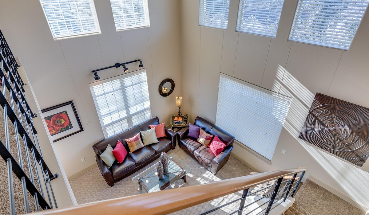
- Living room: milk-white walls, pearl-grey ceiling, brass lamp bases, amethyst and rose quartz accents on the shelves.
- Bedroom: moonstone grey-blue walls, blush linen, a selenite lamp and a soft grey wool throw.
- Kitchen and dining: milk-white walls, pearl-grey cabinetry, malachite-green glassware and agate coasters.
- Hallway: a deeper opal shade — grey with a violet undertone — plus an iridescent runner and obsidian or dark stone hooks.
- Bathroom: soft sheen pearl paint, pale grey tiles, a small amethyst soap dish and an opal-glass jar.
Build it gradually. Start with the walls and ceiling, then add one gemstone accent and live with it for a fortnight before buying the next. Opal-inspired rooms reward patience, and the result is a home that feels calm, layered and quietly expensive — all from shades that never quite stay the same twice.


Leave a reply